What we enjoyed reading this week

Learn to think like an app designer
- Error 404 : Innovative and Evolutionary Design not found
What we need to do, is essentially to consciously declutter our heads, let go of “secret design recipes” for Awwward winning web designs ;) We have to keep in mind that when we design for mobile devices, we must first understand the possibilities and limitations that come with each device, and design accordingly. An app design is never final, it will keep constantly evolving and growing, so we need to design to the effect of “I’ve got 99 problems but design ain’t one.”
(Pro Tip: basing your design on a smaller screen and gradually moving up the size chart is much better than moving down the size chart) - The pen/pencil is mightier than the mouse
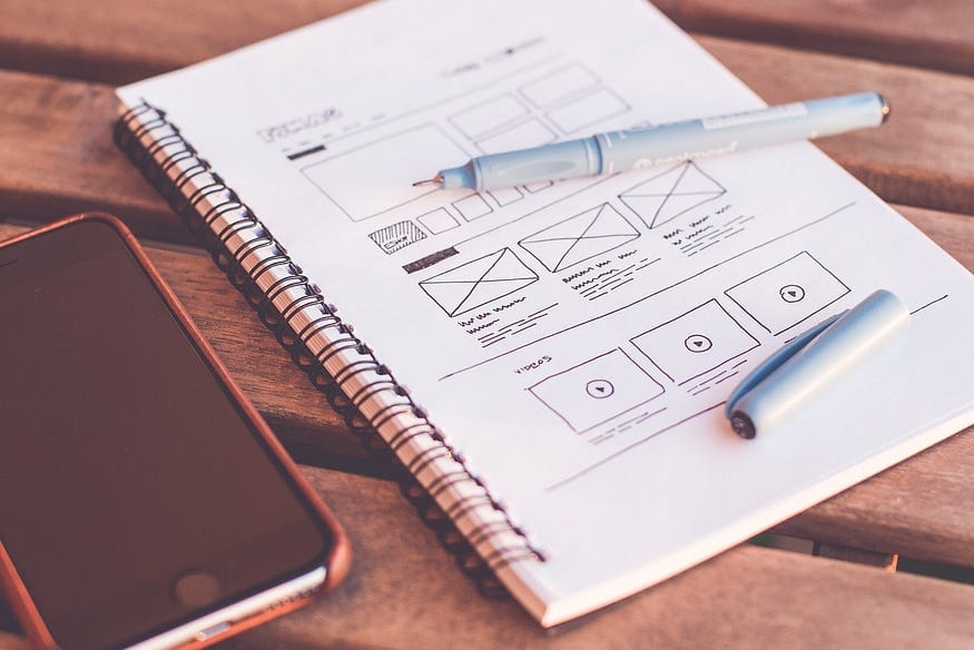
Vague as it sounds, it’s actually truer than any fortune cookie coincidence you may have encountered recently. Putting pen to paper before mouse to Photoshop/Illustrator is a much more time efficient way to approach any kind of design. Even though most of us are used to drawing with pixels, and use Photoshop/Illustrator to breathe life into our designs, realize that it’s waaay less tedious to throw out or tear a piece of paper you made 15-minute rough sketches on, rather than working for 3 hours on a PSD and having to start all over again.
#truestory - The future is here and now
With the mobile app market growing leaps and bounds, Designing for Tomorrow is what’s buzzing today. It’s not easy giving users what they want before they ask for it, so we spend time reading and reflecting, wondering how the apps that we’ve become so dependent upon, do it? And sometimes within the span a micro-interaction, it all makes sense.
But if it doesn’t, just read the article linked above and you’ll have your “Eureka!” moment.
To design is to do what exactly?
- To Design is to plan, problem-solve
When you make plans with a specific purpose that lead to a specific outcome, the process involves solving problems along the way, as well as solving problems as a desired end goal i.e. the outcome. Problem solving, then is at the heart of design, but is that all that it is? All this “problem-solving at the heart of design” sounds great in theory, making us designers feel like superheroes that will change the world, one design at a time; but how often do things really stick to the plan?
Design then, needs to mean more than just planning and solving problems. - To Design is to make decisions
When you design, you make a series of purposeful objective decisions, based on a predefined plan, with the knowledge that in the end, all the decisions are subjective. Decisions that encapsulate the core, the essence of what it is you’re trying to achieve, knowing full well that the outcome may go one way or another. Designing something means making decisions that can evolve with your goals, adapt to your changing needs, and flow in any direction you need them to. But then again, where is the creativity? Where is the art and craft of it all? Where is the glamour and software preferences? - To Design is to make the most of what you’ve got, at all times.
When we take away the creative thinking, the software options, the various tools available to achieve the same outcome, the titles, and stereotypes, we’re left with a process. A process that is built to address a need, marked by decisions which will define the direction of the process, using any and all resources available to successfully achieve its completion. So as designers, we’re no different from anybody else, we get the job done the same way as you do, it’s just that our process essentials like tools and platforms are perceived to be much cooler than everyone else. #justsaying
“Keep it simple” — the gaping void that all designers fall into, few get out of
- “Less is More” Words we’ve all heard before
So how do we do this “less is more” thing? Blindly hack away at elements that occupy screen space but we don’t really understand the purpose of? (decorative elements, I’m looking at you, specifically) God No.
When we say simplify we mean thoughtfully and purposefully reduce, like a gravy or a sauce, you want it to be the right consistency and with the right flavour balance. Naturally first you add all the elements, and then reduce, and then reduce some more, and then some more until it simmers down to the deliciousness your taste buds crave. Keeping it simple is not simply adding more white space, it means intentionally letting go of elements that don’t really do much for the design or are the least significant elements of the design. - To keep it simple is to “keep it real”
Young people of the day are emphasizing on ‘keeping it real’ in their personal lives, by eliminating all the drama, and fake pretenses. That’s all that simplicity is asking of you. Keep it real — uphold the core, the essence, the primary reason for the design, and let everything else fade away into the void that is clutter and flashy, basically #designhell. - ‘John Maeda’s 10 Laws of Simplicity’ is a bible that will lead us into the light, white space.
Simplicity is a hard thing to accomplish with questions like — is this really necessary? Which have no real answers and seem like a fun game until an important element gets thrown out. But luckily John Maeda, knew this problem and came up with 10 rules to lead us into the holy grail that is white space. - Where are the rules you ask? Well read the article and you’ll find out!


